What to Put On Your Homepage (so people actually inquire)
February 27, 2026

I often say your website is the online version of a brick and mortar store. Well, if that’s the case, your homepage is most certainly the storefront. This is the entrance, the display windows, the foliage out front, the A-Frame sign sitting on the sidewalk and the overview of what lies inside beyond the front doors.
So, in other words, it’s extremely important.
What Your Homepage is Actually Supposed to Do
Your homepage is a first impression and it’s also a decision point. It is sometimes the ONLY moment you have to get someone to step all the way in and see what it is you’re offering. Therefore, setting it up right is pretty crucial.
There are a few main aspects that make up a great homepage. Of course, the execution can look a million different ways, depending on your business, offerings, branding, and so on. But, there are some universal truths that can really help or hurt your chances of getting through to your audience.
In this post I’ll cover:
- Homepage checklist (these are all the sections, bits and bobs you should likely include)
- Common mistakes businesses make
- SEO basics you can implement now
Soooo let’s get started!
Homepage Checklist
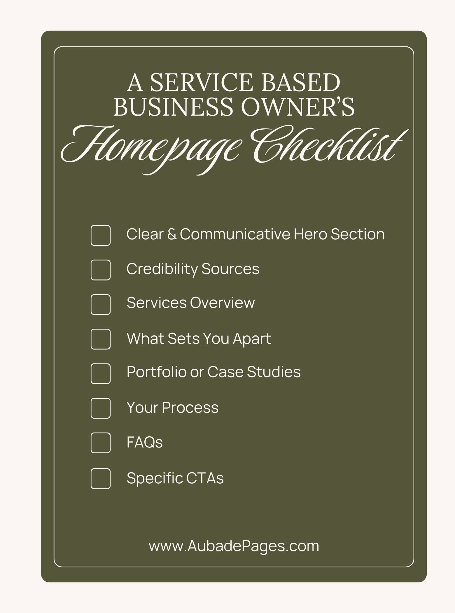
The following list of items you should have on your website are both research-backed and have my own experience and input sprinkled throughout.
Remember: following a guided list does NOT mean your site has to be boring. As a website designer, I am all about bringing beauty to functionality.
Yes, there are practices that genuinely work because they help your clients easily navigate your site and know what your business is about (super important, because we of course LOVE our clients and want them to have a great experience). But, these guidelines can be implemented and achieved with your own sense of flair and they SHOULD be, because who wants a boring site? No one. Duh.
Now without further ado,
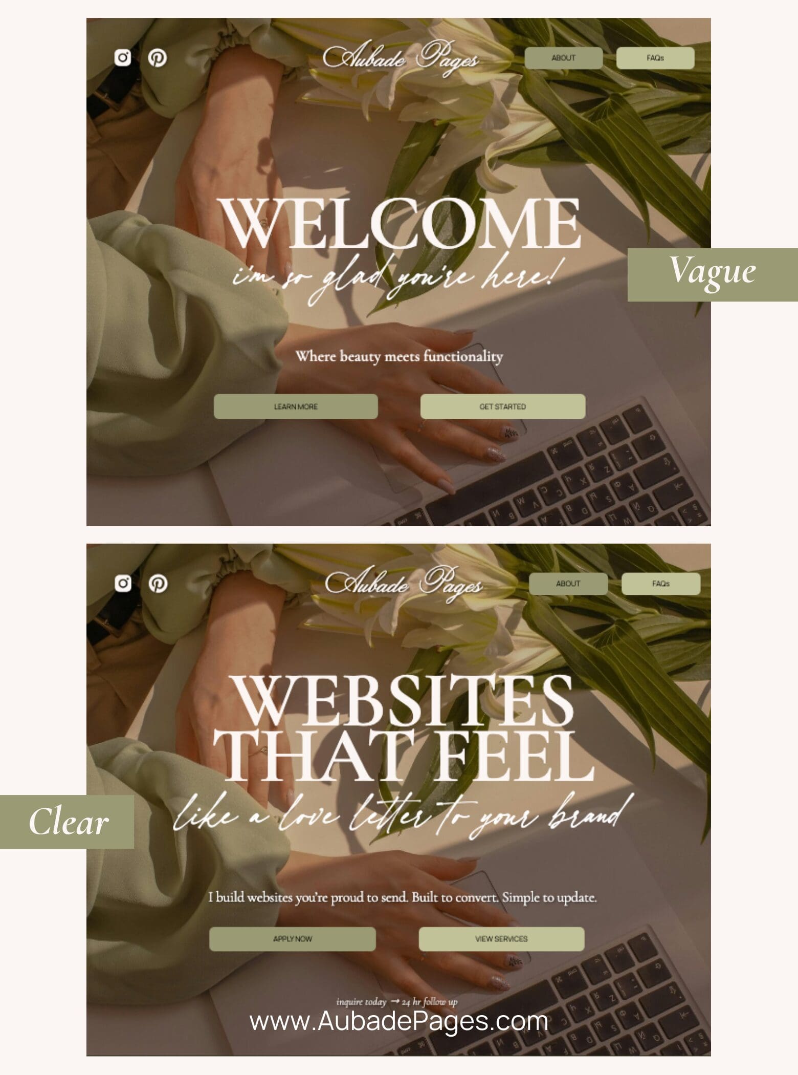
#1 Clear Hero Section
Your hero section is the first section of your website on your homepage. You’ll often hear web devs refer to this area as “above-the-fold” which just means, the area before you scroll down.
So, someone types in your webpage address, your website loads, they don’t click, scroll or anything else. What is on the screen is “above the fold” aka your hero section.
Your hero section should clearly communicate above all else:
- What you do (ex. Web Designer)
- Who it’s for (ex. Creative Business Owners)
- Outcome or benefit (ex. A website you’re proud to send.)
- One Primary CTA (Call to Action: ex. Book Now, Learn More, Apply Here, etc.)
This section is your first (and sometimes only) opportunity to grab someone’s attention and get them to become invested in your business. So, keep it simple to read and don’t throw too many options of where to click next.
Back to my storefront example… imagine walking down a street and you see a restaurant that has giant bold letters in the window, listing every food and drink item on their menu. You’d be pretty damn overwhelmed.
Or worse, they have no sign at all, just a restaurant name that tells you nothing about what’s inside.
Keep the information direct and concise, and keep the CTA simple. Once they step through the doors, then we’ll show ‘em what else we’ve got to offer.
#2 Credibility (Trust Signals)
This could look like:
- Client logos
- Testimonials
- Years of experience
- “Featured in” or certifications
Now, if you are staring at this list shaking your head because you don’t have a single one of these to include, don’t fret. If you’re starting out, it’s okay to not have the credibility layer yet.
However, my advice to you would be to really focus on your copy throughout your site if this is the case. Since you don’t have anything to offer yet so that people can trust you, you have to remember the people on your site are strangers. The second best way for them to trust you is to have plenty to go off of.
So write a blog, a long “About” page, or ensure to include your tone of voice and passion behind your work. It’ll go a long way in helping the people viewing your site feel comfortable in trusting you know what you’re doing
Oh, and then when the testimonials do roll in, be sure to add them to your homepage!
#4 What sets you apart
This is the fun part. This is your value proposition. Your chance to show your audience why you. Don’t be afraid to niche down here or “alienate” anyone. This section doesn’t need to appeal to every person reading it.
Stay generic, and end up blending into your competition.
Stand out, and really connect with those who resonate with your story.
Really use your own voice here, don’t get too technical with jargon to prove you know what you’re talking about. They know you’re the expert already, speak in their language.
Think:
- What makes you different from your competitors
- Why does your approach matter
- Do you have a personal story or tie-in to the work that you do
#5 Portfolio Examples
- Before and afters
- Projects you’re especially proud of
- Great testimonials
- Mini case-study snippets
Now, as I mentioned before, if this is something you don’t have yet that’s totally fine, but once again you may need to work harder here to really showcase your voice and what it is you do!
However, if you do have work you’re proud to show, do it! In fact, have a few examples on your homepage and link them to a larger portfolio page, this could even be a mix of case studies, photos of work and testimonials.
You can also work these into your service section to show examples of your work so your audience can determine whether or not they’re a good fit.
#6 Your Process – “How It Works”
This is the space to reduce any uncertainty your audience may have. If they’re especially new to hiring someone like you, laying out the process will not only give clarity but they’ll even be able to visualize themselves in it!
Going back to my physical store comparison, this is like letting them try something on in the fitting room!
Just don’t get into the fine details, remember the homepage should be skimmable for most.
Think:
- 3-5 step process
- what happens after they inquire
- timelines
#7 FAQs or Objections
Now, this shouldn’t be defensive or overly explaining yourself and your prices. Present it as informational, because that’s what it should be. Have a long timeline? Explain why as a practical conversation.
Have higher prices than most of your competitors? Once again, offer the simple explanation, not the defensive rant.
The above should go without saying, but it’s important to hear. When you’re questioned about your business and why you do certain things the way you do it’s natural to want to defend it because you care. But this isn’t an attack, this section is to simply reduce any decision friction that might come up.
#8 Final Call to Action
The bottom of your homepage (before the footer), your last chance to get them before they head out the door.
Make this one specific. Some examples being:
- Explore Services
- View Portfolio
- Start Your Inquiry
Generic would be something like “Get Started” or “Let’s Go”. Clicking these and not getting what’s expected, (which is very possible if you’re using vague language) isn’t going to land you any brownie points with your clients.
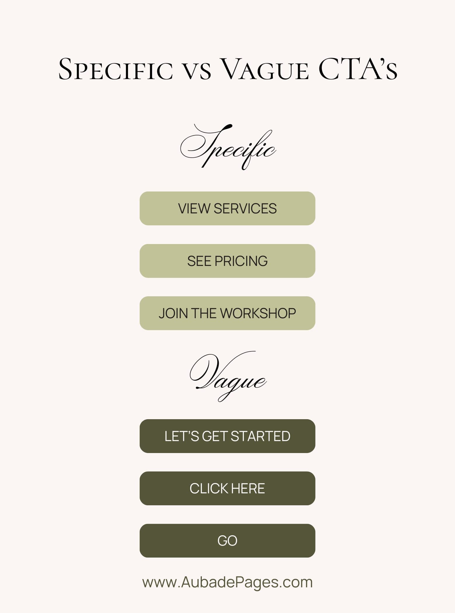
In fact, it may cause some people to exit. In the current state of online apps and webpages, people expect results fast. Making it harder to get where they’re trying to go may make them just go somewhere else less complicated.
Remember to make your call to action specific to your goals. Don’t just copy what someone else is doing. Think about the current state of your business and what you want to nurture most. This primary CTA can change over time.
Common Homepage Mistakes
- Vague Hero Text
- (Welcome, Hello, no clear description of what you do)
- Too Many CTAs
- Yes, you may be eager to make the sale, get newsletter sign ups, have them read the blog and apply for your next workshop all at once. But there’s a time, place, and season for each of these. And they should not all at once live on your homepage. They should all exist within your site of course, but strategically placed, don’t overwhelm.
- Generic “Get Started”
- Using this as a button could mean so many different things to different people. The last thing you want to do is frustrate a potential client because they can’t figure out where they’re going on your site.
- Walls of Text
- Now, I love to yap. It’s all over my site. My About page is huge and much more than anyone asked to know about me, but that is precisely why it’s separate, rather than taking over the homepage. If someone decides to travel there, it’s because they want to know more. Save the text heavy walls behind CTA buttons. Then they get the details.
- No Proof or Examples
- If you’ve got something to show, please show it. If you have no photos of your work, set aside time to get a photoshoot in order. It is so insanely helpful to increase sales. Remember, the internet is a big place, anyone coming to your site is a stranger, treat them like they know nothing! Show-and-tell is your best way to achieve this!
- Cluttered Visual Hierarchy
- As an artist first, it’s easy to get caught up in the design of it all. Especially if you feel “more is more”. But remember, it’s all a balance. We want beauty and functionality to work in tandem on your site. Don’t overcrowd sections and make it hard to figure out the main message.
- Burying the Next Step
- Don’t make it a scavenger hunt to get to your sales page or to sign up for a course. If it’s your main goal, it should be overly easy to access on your website.
- Forms With Too Much Friction
- Once again, we’re deterring friction at all possible steps. Don’t make an insanely long form to fill out, or one that’s hard to find. The easier it is, the better. Instead of all short form answers, use some multiple choice. Don’t ask for all their information up front, just the most pertinent.
Homepage SEO Basics
Alright, without getting too technical, let’s hit a few SEO basics you can include on your website.
- Use Correct Tags – Title, H1, H2, etc. all of these tags on your website are used by browsers (and accessibility devices) to read your site. Ensure your site information is correctly tagged, and you’ll be recommended to the right people.
- Have a Useful Meta Description – If you’re a fellow Showit user, meta descriptions exist for each page of your site (other site building platforms typically let you fill this out as well). Fill these out so that they’re descriptive and page specific. Google uses these to read what your page is about and suggest them to the proper audience searching online.
- Use Internal Links – (within your site) to your other pages (ex. services, contact, portfolio, etc.). This helps Google find, understand, and prioritize pages on your site. AND it helps people navigate your site, which in turn, supports your site performance.
- Optimize Images – Use alt text for all images on your website, make sure they’re contextual and helpful, not just keyword stuffed
- Performance Optimization – One instant way to speed up your site is ensuring your image file sizes are not much larger than they need to be. Having a fast-performing site is crucial to prevent people from leaving. There are many ways to optimize performance, but I would highly recommend at the very least ensuring any photos and videos aren’t taking up too much bandwidth.
Simple Homepage Starter Framework
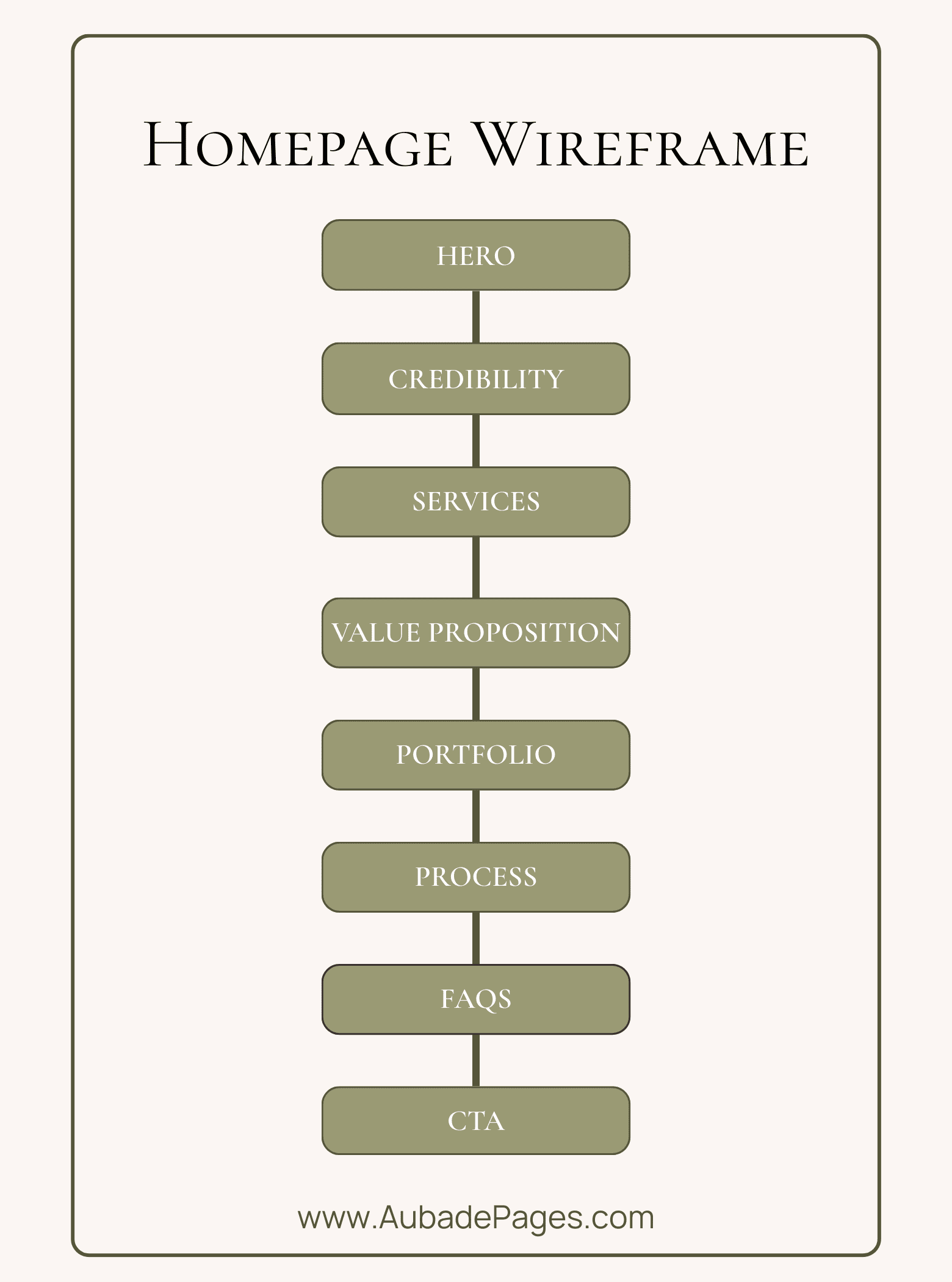
Use this wireframe as a starting point for your homepage! Feel free to rearrange and make it your own, you can add a marquee for your latest offering, pop-ups for a blog, or anything else that suits your business!
This is just the framework, the fun begins when you put your own design, branding, and unique story on the page. So most importantly, don’t forget to make it true to you.
Conclusion
If I had to bring it down to one thing, my advice would be don’t overthink it. Start with a simple wireframe to get the order of your sections down, write your copy so it’s clear and concise, and then design around that. Remember: less, is more. Add your own branding, style and voice, but don’t oversell yourself.
The homepage is just the entrance of the store. We don’t want to throw everything at them all at once. Just get them in the door, and then let them browse through. ♡
Now, if you’re looking for more helpful business tips on design, marketing, and navigating the online space to stand out, feel free to join my newsletter! I’ll be in your inbox Sunday mornings to add a little education to your cozy morning routine. ☕️💌
Or, if you’re looking for a super fun web developer to make your website dreams come true. Feel free to fill out an application to work with me or check out my Design Menu!
Thanks for reading,
See you next time!
Brianna | Aubade Pages

